When we set out to design the logo for Democracy Reform New Zealand, we faced an unusual challenge. Most political parties choose a single colour and a simple symbol — red for Labour, blue for National, green for the Greens. They plant their flag in one corner of the political spectrum and say: this is who we are.
We wanted to say something different. We wanted to say: this is who you all are.
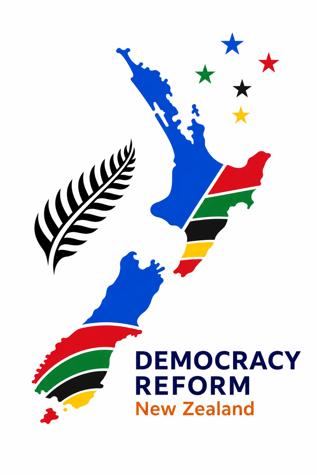
The New Zealand Map
The centrepiece of our logo is the unmistakable silhouette of Aotearoa New Zealand — both Te Ika-a-Māui (the North Island) and Te Waipounamu (the South Island). This isn’t decoration; it’s a statement. Democracy Reform NZ is for all New Zealanders, in every region, every community, every electorate.
Inside the map, you’ll notice something unusual: bands of colour running through both islands. These aren’t random — they represent the colours of every party currently in Parliament:
- Blue — National Party (largest band, reflecting their current share of Parliamentary seats)
- Red — Labour Party
- Green — Green Party of Aotearoa
- Black — NZ First
- Yellow — ACT New Zealand
- Red — Te Pāti Māori
The proportions of each colour band roughly reflect each party’s share of seats in Parliament — a visual reminder that our democracy already contains many voices, and that reform must serve them all.
This is perhaps the most “corny” and “uncommercial” aspect of the logo — and we think it’s the most important. A party devoted to democratic reform cannot claim to represent only one tribe. The multi-colour map says: whatever your political home, the health of the democratic system that gives you a voice matters to all of us.
The Koru
At the centre of the map, where the Cook Strait separates the two main islands, sits a koru — the unfurling fern frond that is one of the most recognisable symbols in Māori art. The koru represents new life, growth, strength, and peace — concepts deeply woven into te ao Māori and the identity of Aotearoa itself.
The koru is also a central motif in the visual identity of Te Pāti Māori, whose branding features kowhaiwhai-inspired patterns and koru forms. Its placement within the land area of the map is a deliberate acknowledgment of this connection — the koru belongs to the whenua, to tangata whenua, and to the party that most directly represents Māori political voice in Parliament.
More broadly, the koru in our logo represents the Treaty partnership — Te Tiriti o Waitangi — that sits at the heart of New Zealand’s constitutional arrangements.
Placing the koru at the geographic centre of the country is a deliberate design choice. Te Tiriti is not an appendix to our democracy; it is foundational to it.
The Silver Fern
To the left of the map stands a silver fern — ponga — in black. The silver fern is New Zealand’s most internationally recognised symbol, carried by our sports teams, worn by our soldiers, and displayed at every occasion where we want to say: we are from here.
We considered rendering the fern in our brand colour (amber-copper) or in geometric form — approaches that would have been more “designerly.” But we deliberately chose the traditional black silver fern because this logo isn’t about Democracy Reform NZ as a brand. It’s about New Zealand as a country. The fern says: this is a New Zealand project, by New Zealanders, for the benefit of all New Zealanders.
The Southern Cross
To the right of the map, five stars form the Southern Cross — Māhutonga — the constellation that has guided Pacific navigators for centuries and appears on our national flag. Like the colour bands within the map, each star is rendered in a different party colour, and the size of each star reflects that party’s proportional representation in Parliament.
The largest star (blue, for National) dominates, just as it does in the current Parliamentary makeup. The smallest (red, for Te Pāti Māori) is still present — because in a healthy democracy, every voice counts, no matter how small the caucus. The Southern Cross has always been a symbol of navigation and finding your way. Here, it suggests that the diversity of our Parliament — all those different-coloured stars — is itself the constellation that guides the nation.
The Typography
DEMOCRACY REFORM appears in navy (#1F3864) — a colour deliberately chosen to be distinct from National’s brighter blue (#003580). Navy conveys authority and seriousness without claiming any partisan territory. New Zealand appears beneath in teal, providing a visual anchor and a softer counterpoint.
What We Deliberately Left Out
Professional brand designers would tell you this logo breaks many rules. It has too many colours. It can’t be simplified to a single-colour version. It doesn’t work perfectly at 16 pixels wide. It doesn’t have a clean “icon” that works as a social media avatar.
They would be right — from a commercial branding perspective. But Democracy Reform NZ is not a commercial product. We are a political project that believes our democratic institutions belong to everyone. A sleek, minimalist logo representing a single brand identity would have contradicted our central message.
We did not choose amber-copper as our “party colour” even though our brand research identified it as completely unclaimed in New Zealand politics. We did not choose geometric abstraction even though it would have been more sophisticated. We chose, instead, to wear every party’s colours — because the reforms we propose would benefit voters and citizens regardless of which party they support.
The Design Journey
The logo went through extensive development. Early concepts explored geometric fern reinterpretations, amber-copper colour schemes, and various levels of abstraction. We worked with both ChatGPT (for image generation) and Claude (for brand analysis and design concepts) to iterate through dozens of variations. The full brand review examined every registered party’s visual identity — logos, colours, typography, and design language — to understand what visual territory was already claimed.
In the end, Godfrey Bridger chose the direction that best embodied the party’s philosophy: not a logo that says “vote for us” but one that says “this belongs to all of us.” The multi-colour map with party-proportional bands, the traditional silver fern, and the party-coloured Southern Cross — each element chosen to reinforce the same message.
Is it corny? Perhaps. Is it uncommercial? Absolutely. Does it say exactly what we mean? We think so.
The party colour proportions in the logo are based on the composition of the 54th New Zealand Parliament (2023 general election). As Parliamentary representation changes, the logo serves as a snapshot of our democratic diversity at the time of the party’s founding.